New Thoughts for De la Guerra Plaza
Some Reimagined Ideas for the Center of Santa Barbara
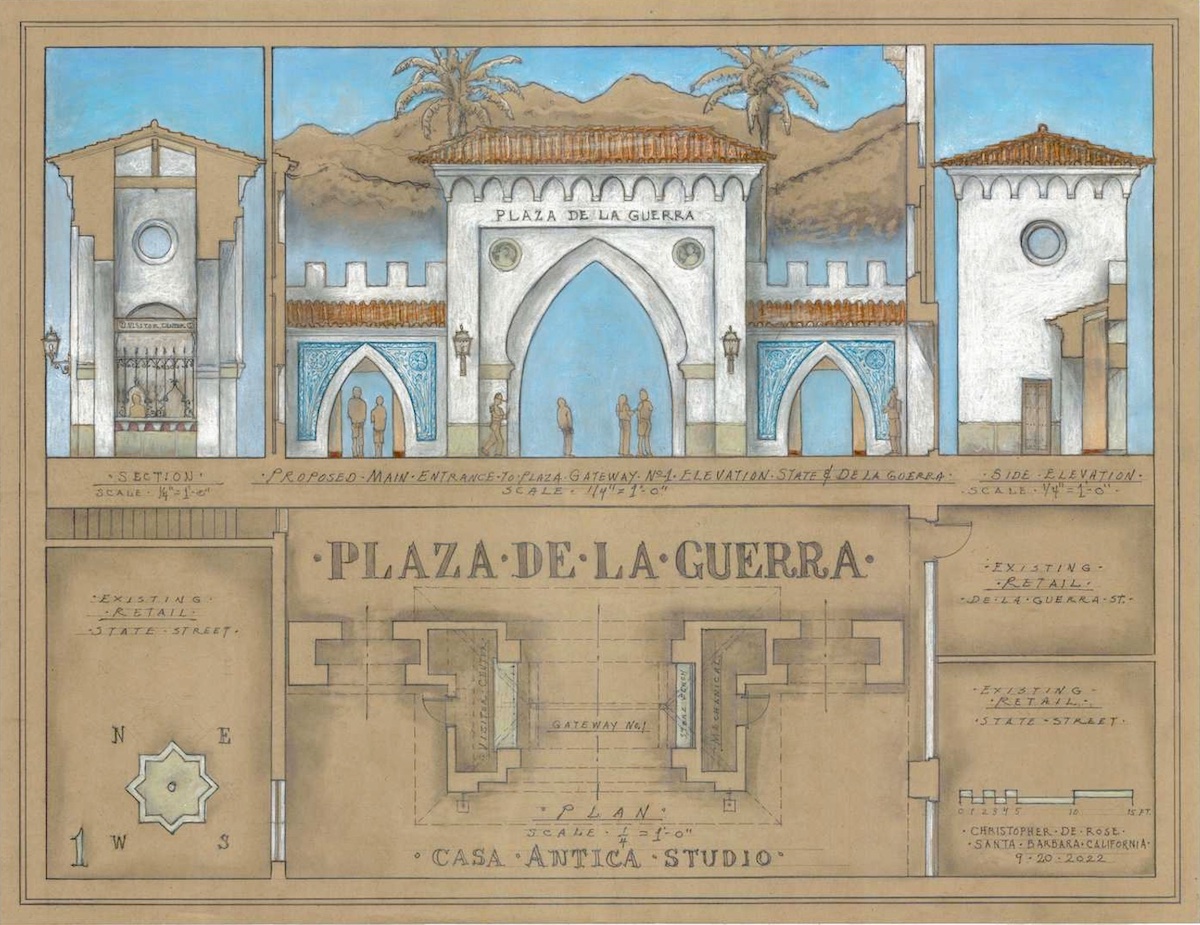
We have waited 100 years for a design worthy of our Plaza De la Guerra. Let ’s finally get this extremely important civic center of our town designed and working for its citizens, in the way it not only should function but as it was intended and hoped to be. This will not only bring people to the plaza, but also to the downtown area, and to State Street. It will put it on the map as one of the important, historical places to visit, along with the likes of our courthouse , our mission, and our waterfront.
Few people know the history of the plaza. The brief period of three years — 1922 to 1924 — is when most of the buildings that define and create the edges of the plaza were built. During this time, there were many wonderful designs and concepts proposed for the actual plaza. Sadly, none of these ever got built.
On June 29, 1925, Santa Barbara was struck with a devastating earthquake that required the city to refocus on rebuilding the city itself and thus put the plaza on pause. Next came WWII. So what we have in terms of a designed functioning plaza is actually an accident, or an undesigned space. It has never been the plaza that we were intended to live with for so long.
The previous City Hall sat in the center of the plaza. It was torn down in 1922 to make way for the plaza to be created, while a new city hall was being designed in the new Santa Barbara Spanish theme. where it sits today.
North Side of the Plaza: Home and Courtyard of Casa De la Guerra, built for the De la Guerra family. From the Mexican period of California. 1819 Adobe: restored by the S.B. Trust for Historic Preservation in 1990s: creates a good north end to the plaza.
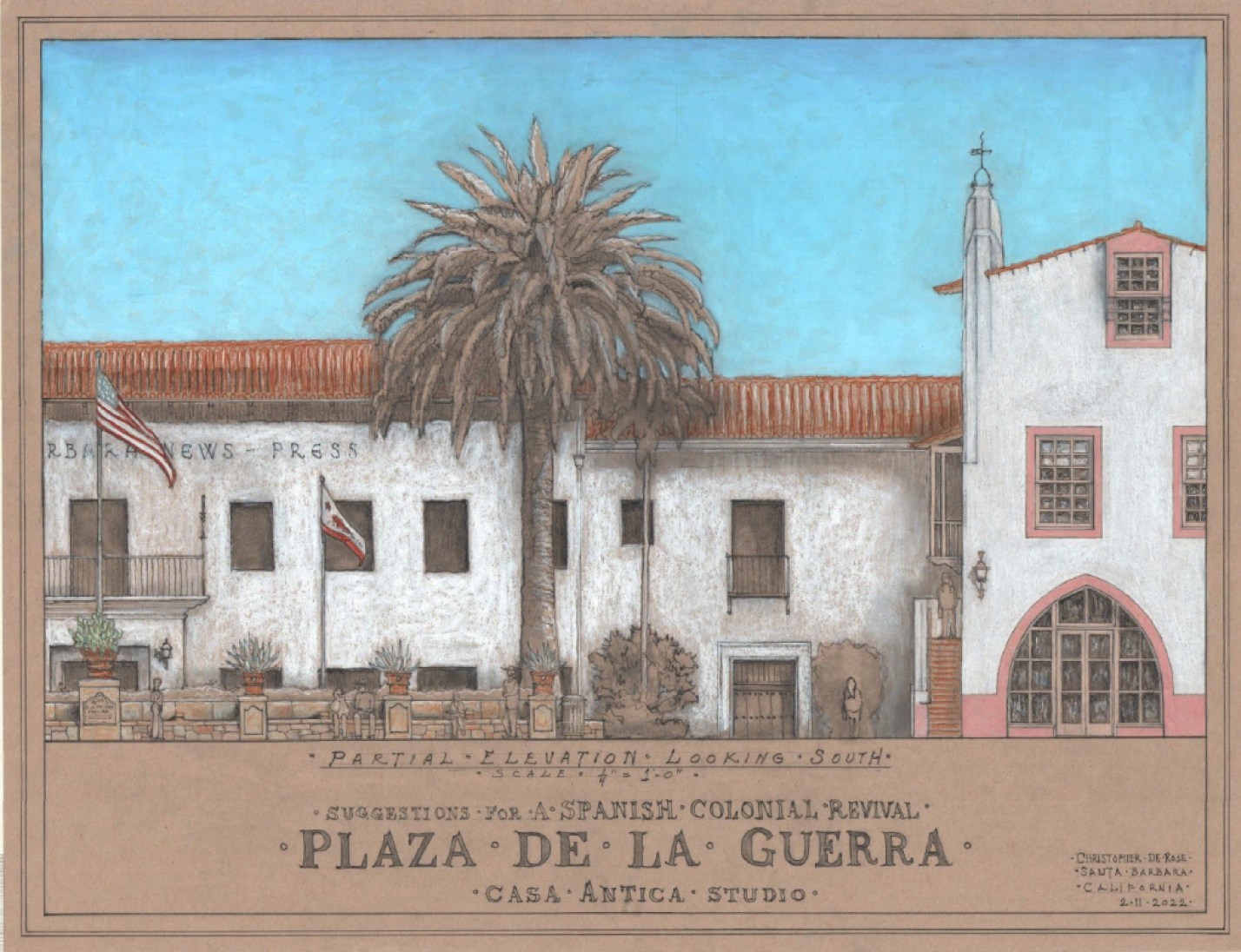
South Side of the Plaza: News-Press Building built in 1922 : George Washington Smith design with Lutah Maria Riggs: creates a solid cohesive southern edge to the plaza.
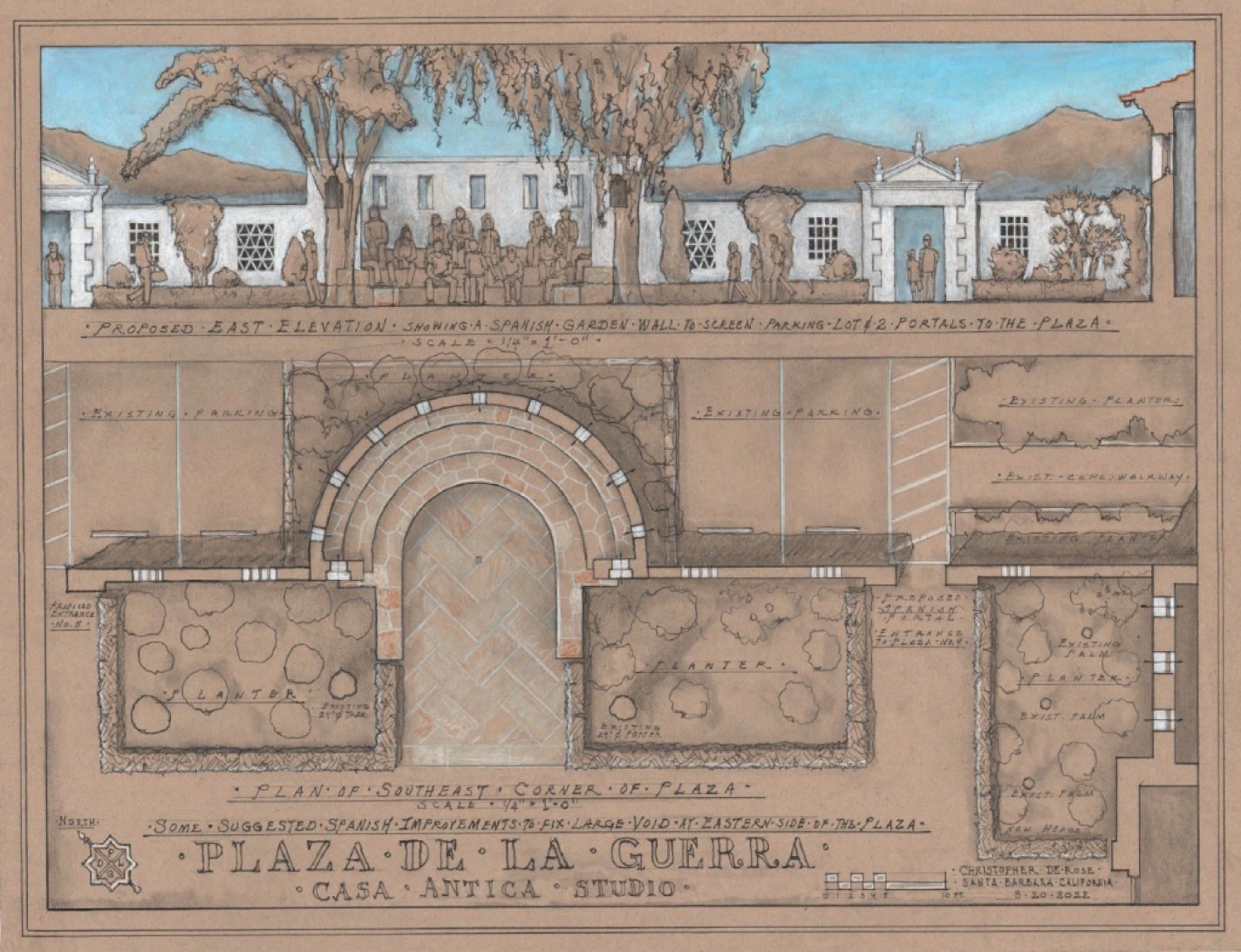
East Side of the Plaza: City Hall built in 1923: Sauter & Lockard Architects, anchors the corner of the plaza. The Abadie adobe, between City Hall and the News-Press, was badly damaged in the earthquake and had to be removed. Drawings from this time show plans to replace one or two buildings on this side of the plaza, and to continue the edge of the plaza to the News-Press building. None of this was ever built. So there is a large void and a parking lot here now, which needs screening and other design solutions, such as a garden wall, with new portals or entrances so arrival to the plaza would be a better experience than what currently exists.
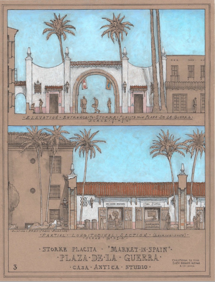
West Side of the Plaza: La Placita: 1925, Lionel H, Pries, Architect, built to replace the previous building destroyed in the earthquake. Much of what was originally proposed for this side of the plaza was never realized. And we have mostly the backs of the buildings that are on State Street. The proposed arched entrance into the Storke Placita and the single row of nine palm trees would greatly improve this side of the plaza. (See drawing of West Elevation and Longitudinal Section.)
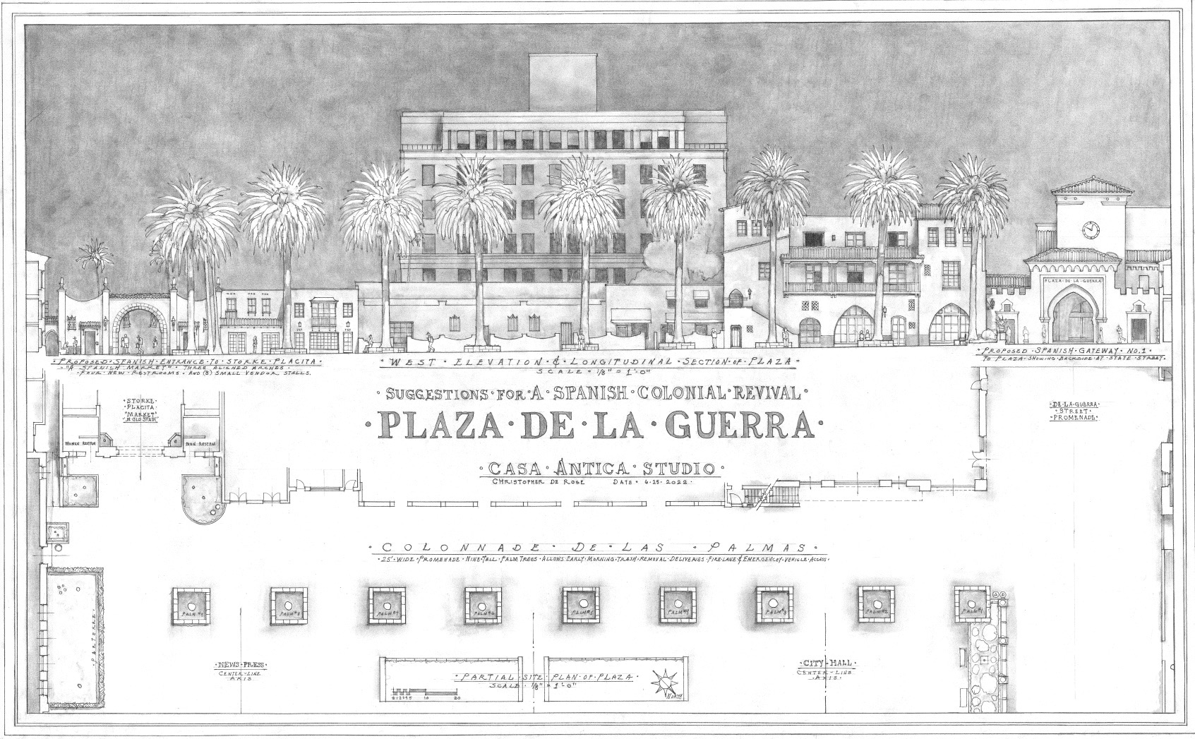
Six Design Features that Will Fix the Plaza
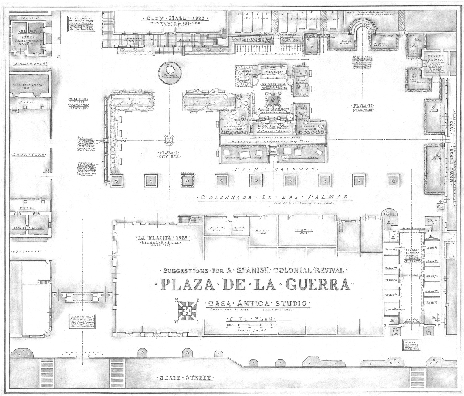
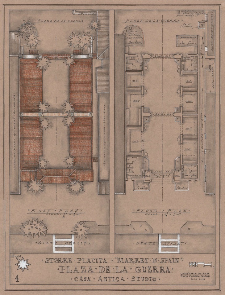
(1) Colonnade de las Palmas: This is a promenade into the plaza on the west side. Nine tall palm trees in a single line create an allee effect, or a boulevard. This landscape element acts as a colonnaded hallway (the base of the large palm trees), and it not only provides an access road for emergency vehicles but also allows for early morning trash removal and deliveries, eliminating the underground trash collecting currently being proposed . This north-south axis does two other things. It connects the various parts of the plaza together (providing good circulation throughout the plaza). It also allows the other half of the plaza to flip its orientation to an east-west axis relationship. Now one is directly in line with the center of the doors to City Hall and orientated toward the view of the mountains.
The tall height of the palm trees changes the spatial qualities of the plaza and help work with the over-scaled Balboa Building (at State) which can be seen from the plaza. This also helps the west side of the plaza because the architecture that was always intended to be front facades facing the plaza never happened, and we look at the back side of the State Street buildings.
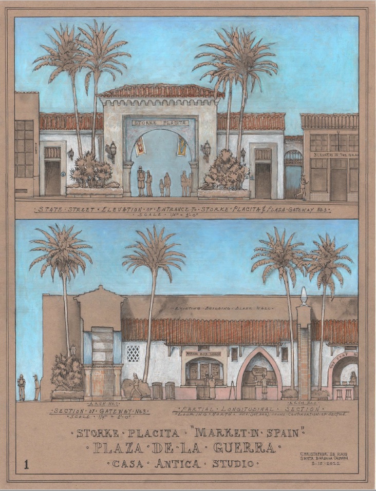
(2) Storke Placita or Spanish Market: This later addition to the plaza allows another outlet to State Street and never has been much more than a left-over space and a landscape mess. By introducing three large arches, a Spanish tunnel effect is created and frames the mountains at one end and frames State going the opposite direction. Sloped tile roofs are on both sides and four new restrooms are also located: two at State Street and another two at the plaza side. The small market stalls would be satellite locations for hopefully food vendors that produce their product elsewhere.
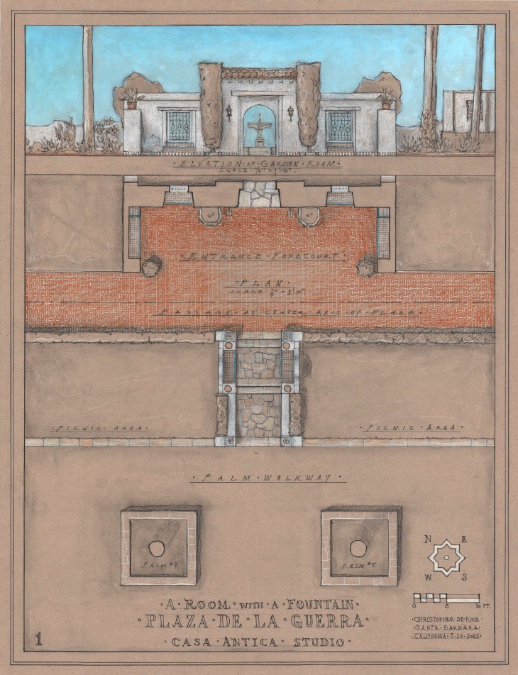
(3) De la Guerra Street Promenade: Recently the city has decided to close the entire plaza and part of De la Guerra at State to vehicles. The suggestion here would be to make the entire De la Guerra Street into one long Promenade, from Anacapa to State Street. This would add a considerable amount of additional area to allow for Fiesta and other events. There would be a main gateway entrance to the plaza at State (as in the drawing up top) and also a gateway entrance at Anacapa (more minor entrance than at State). Special pavement would occur at each different location. Palm tree courts would be at each end just inside the entrance.
(4) City Hall Plaza: This new east-west axis proposes a more intimate plaza but still fairly large considering that there is a forecourt at the front of City Hall centered with the doors, then the historic pepper tree, lots of drought tolerant planting, potted plants, and 10 or more wooden benches. The space continues under the palm trees, where there is a sandstone bench base all the way to the La Placita Building. (See Site Plan).
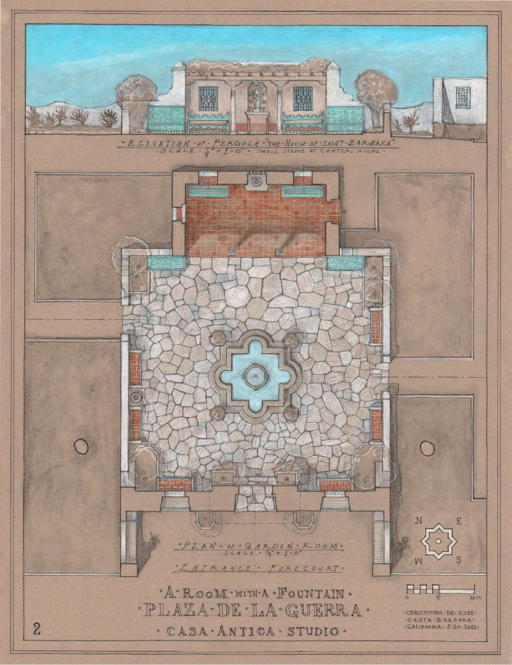
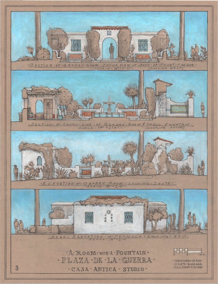
(5) Garden Folly or old Adobe Ruins: This is a play on recreating some of the parts of the Abadie Adobe, which was removed from the damage it suffered from the 1925 earthquake. It also is a reflection of the sunken gardens at the courthouse. Basically, it has low (3’6”) walls when it needs to be low and higher walls at the front and back to create an entrance doors, which could be locked at night, and a small intimate pergola, which looks at the small residential-scaled fountain made out of Santa Barbara sandstone with the garden sound of splashing water. The pergola has the quality of sitting on an old adobe porch, and there are five different types of benches proposed. If it is determined that the entire secret room with a fountain needs to be totally locked up at night, there are a couple of ways of achieving this. Also has a E-W axis and forecourt and other landscaping.
(6) News-Press Plaza: This is also an intimate-sized plaza with an east-west axis, running opposite direction of the Colonnade De Las Palmas but intersecting it . Also on the E-W axis is a lecture area, half-circle form with sandstone bleachers. This plaza can be used at the same time other parts of the plaza are being used which creates flexibility, and a friendly environment for enjoying the plaza. The garden wall at the eastern side screens the parking lot and adds three garden entrances, along with other landscape amenities. The pavement here would be similar to plaza I, but on a diagonal pattern, giving uniqueness and variety. The theme here is hedges around the planters or parterres relating to the more formal aspects of the GWS News-Press architecture.
I expect my designs will be redesigned, thrown out, and greatly changed. But let’s do something now. Please, it will soon be too late.




You must be logged in to post a comment.