When moving into a new home or updating your forever home, most of us, rightfully, focus on acquiring the largest items — such as sofas, chairs, and beds — first. What’s a room if you have nowhere to sit or sleep? But often that’s as far as we get. Family, work, and other commitments take up our day-to-day, so completing a room or the entire home can sometimes take years. Often, artwork is the last to get hung, or, rather, one piece gets hung and we call it done.
If your home doesn’t give you the finished appeal you’ve hoped for, perhaps it might be time to look at the walls to see where your artwork does (or doesn’t) live. Artwork adds personality, color, and texture to a space and helps to create the mood of a home; however, achieving a truly polished look means mixing up how and where you display the artwork itself.
Whether you want to show off family photos, your grandfather’s watercolors, or your collection of vintage concert posters, the ways in which can display art are numerous. Here are a few of my favorite tips to style artwork throughout your home for a designer look:
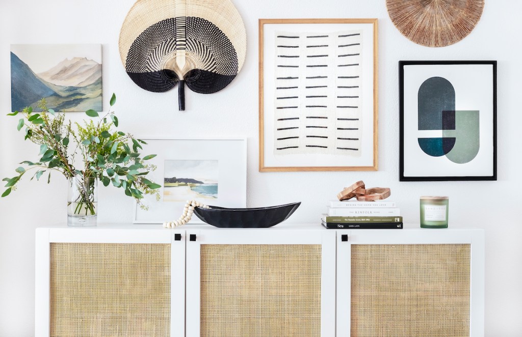
Gallery Wall: Creating a gallery wall can feel daunting, but it’s a great way to fill a large area and display a collection at the same time. Gallery walls can be symmetrical or asymmetrical, and one of the first decisions to make is whether or not you want everything framed in the same material. Some people prefer to display black-and-white family photos of the same size and in the same frame; this works well when hung in a symmetrical grid. Others may prefer to use frames made of different materials or colors and in different sizes, which lends well to an asymmetrical display. I recommend laying out the pieces on the floor beforehand to determine the best arrangement.
Layered on a Bookcase: Scroll through interior design blogs or your favorite home décor catalog and you’ll likely see artwork displayed on the shelves of a bookcase or built-in shelving. It’s really one of the easiest ways to create a pro look! Simply lean the art against the back of the shelf and add a small stack of books in front of it. Using art and other objects, such as a vases or bowls, throughout your bookcase adds interest and can be easily styled with no hanging needed.
In a Corner and with a Chair: This may sound like a no-brainer, but many people miss this opportunity to create a standout moment in a room. If you’re hanging art above a chair in a corner, make sure the two are close enough to each other so they feel visually connected. To do this, hang the bottom of the art/frame between five to 10 inches above the top of the chair.
On Kitchen Shelving: Similar to adding art to a bookcase or shelving, artwork leaned or hung at the back of open kitchen shelving adds a bit of the unexpected, which is what I love about it. Pair it with a stack of ceramic bowls and a wooden cutting board and viola — kitchen vignette done!
Above the Mantel: Typically, the fireplace is the focal point of a room, making it a great place to display a treasured piece. Ideally, your artwork is about three-fourths the width of your mantle and centered above it. Or, if your favorite piece isn’t wide enough, you can create a grouping of art on the mantle leaned against the wall. Be sure to vary the height and width of your pieces. I love adding an arched mirror as part of this grouping, but be sure to secure anything with glass to the wall (even if it is leaned against the wall).
The Leaning Vignette: If you’ve made it this far in my column, you’ll see a theme emerging: artwork that is leaned instead of hung. I’m a fan of this approach for two reasons: (1) no hammer and nails required; and (2) it’s easy to swap out whenever you desire. However, it does take a little time to master the art of the casual lean without making it look like you forgot to hang it.
Start by leaning your favorite piece on top of a sideboard or sofa table that is placed against a wall and build around it. I prefer to off-center my favorite item, and then add accessories, such as a stack of books topped with recycled glass beads, on the flat surface in front of my leaning artwork.
I’d love to see the artwork displayed throughout your home! Tag me on Instagram @VacayRentalDesign. Happy styling!
Christine S. Cowles is owner of Vacation Rental Design, an interior design company specializing in short-term rental properties. She is a certified Short-Term Rental Stylist™, member of Real Estate Staging Association, and a proud WEV graduate. She can be reached at hello@vacayrentaldesign.com.

