Toward the end of every year, paint companies select their choices for Color of the Year. As someone who lives for design and color, I eagerly await these announcements. More than just looking at pretty colors, I try to determine what these colors have in common. And more so, what do these colors say about today — and tomorrow?
Color experts arrive at their selections each year by looking for global color trends in fashion, design, and art as well as socioeconomic or political conditions. Influences may also include new materials, textiles, or fabrics that impact color. In turn, these color selections become a forecast for what we will likely see in new products, clothing, and home decor for the upcoming year.
Get the top stories in your inbox by signing up for our daily newsletter, Indy Today.
So far, the colors announced are earthy and comforting, rich and warm. New neutrals to stand tall. These shades make me want to cozy up around the fireplace with a good book and cup of tea. And I’m pretty sure that’s not a coincidence. All paint companies cited that our COVID world had a palpable impact on their color selections. Here are my two favorites:
Sherwin-Williams’ 2021 Color of the Year: Urbane Bronze


Grays have been popular in interior design and home decorating for the past decade, but gray — often a cold color — can be tricky to pair with the warm wood cabinets, flooring, and furniture that are popular now.
Meet your new gray. Urbane Bronze is warm and earthy and is the perfect color for turning a room into a sanctuary space. Not ready to paint your entire bedroom this color? Try updating your powder room with this sophisticated shade.
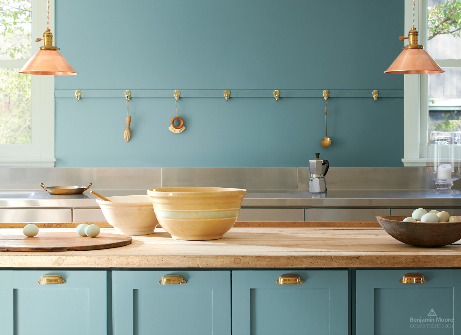
Benjamin Moore’s 2021 Color of the Year: Aegean Teal
If this calming blue has you dreaming of being on a remote tropical island, you’re not alone. I’m not sure if that was the intent when Benjamin Moore selected this blue-green shade for their color of the year, but it’s got me thinking about lying on a warm, sandy beach where I wish I had been stuck for the better part of 2020. This color pairs beautifully with natural materials such as wood, stone, and metals, making it a great choice for the kitchen.
What do these colors say about next year? I don’t have a crystal ball, but I do know this much: Color has a big impact on our psyche. So if your home isn’t a haven that makes you happy, it’s time to get out the paint brush and create your sanctuary.
Christine S. Cowles is owner of Styled & Staged Santa Barbara, offering home staging and interior styling services. She is a certified Staging Design Professional™, member of Santa Barbara Association of Realtors and Real Estate Staging Association, and a proud WEV graduate. She can be reached at info@styledandstagedsb.com.
Every day, the staff of the Santa Barbara Independent works hard to sort out truth from rumor and keep you informed of what’s happening across the entire Santa Barbara community. Now there’s a way to directly enable these efforts. Support the Independent by making a direct contribution or with a subscription to Indy+.


You must be logged in to post a comment.