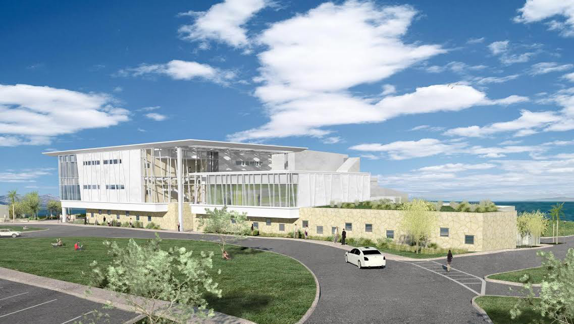
Over the years, many buildings have arisen on the City College campus to accommodate growing need. With the exception of the terribly dated Humanities Building, which mercifully is tucked into the campus where it is not so noticeable, most of the buildings pay homage to Santa Barbara’s Spanish/Moorish architectural heritage.
The West Campus Classroom and Office Building(s), in contrast to nearly all earlier structures, is a clear departure from SBCC’s, and greater Santa Barbara’s, architectural tradition; it is a strident poke in the eye. It has more of a relationship to visiting cruise ships than to any architecture in the area. There is nothing about it to give the impression it is meant to fit into the context of the beautiful campus and its many “quiet” buildings. It screams for attention. The notion that good architecture does not attempt anything that it cannot do well is clearly missing here. This building looks more like what a wealthy donor would have funded, but sadly, the building is a huge waste of public money, an irresponsible exercise in architectural excess and a giant blemish on the skin of the beautiful West Campus.
The building is oversized for its purpose, and it dominates the landscape and skyline of West Campus. In the Final Mitigated Negative Declaration for the project, a neighbor’s letter regarding the size of the building is responded to, pointing out that the Garvin Theater building is 62 inches above grade, while the new building would only be 45 inches tall. It goes on to state “[It] would be compatible with the existing mass and scale of other buildings on West Campus.” This response fails to note the fact that the new building sits on higher ground and consequently completely obscures the Garvin from the West Campus entrance.
I see a huge metal structure extending several feet to the northeast and northwest, and am perplexed, trying to figure out its purpose. On the western façade of the larger building, there are curved panels suspended from the structure that presumably moderate the effect of direct sunshine into the large mass of windows on that side. These panels seem more decorative than functional, but if they do serve a sun-control purpose, couldn’t this effect have been more efficiently accomplished without the enormous superstructure cantilevered off the roof?
I am also curious about those massive window walls that occur on the eastern, northern, and western sides. On the eastern elevation alone, there are 72 individual panes of glass, custom-cut to match an odd arrangement of mullions. The pattern of these odd-angled mullions is repeated in application on the stark stucco walls on the northern side, but stop abruptly in the middle section, where the building takes on an entirely different, but equally odd, plainness. I’m also curious to know what function is served by the big volume these windows enclose. There are spaces inside the windows that, from outside, do not look like either “classroom” or “office,” on both the eastern and western ends of the building. I can’t help wonder what this building cost per cubic foot.
Why are there two buildings? If one is the “classroom” and the other the “office building”, why could both functions not be served under the same roof and within the same four walls? Instead, there are two separate buildings, connected by a catwalk. A substantial amount of money was spent on the connecting pedestrian structure, not to mention two completely separate buildings. This is our money! We voted for Measure V. Is this what we should have expected?
Other than homage to a common, beloved local building material, what is the purpose of the sandstone veneer on the western ground floor of the western building? Though the sandstone is the sole element on the entire structure that has anything to do with traditional Santa Barbara architecture, this veneer is completely out of place and a waste of many thousands of dollars. It has no relation to anything else on the building. In the context of a big stark-white mass of stucco, it is a very costly adornment with no purpose. In terms of architectural integrity, the stone veneer loses credibility as it wraps around the corner at the western end, only to stop abruptly at an outside corner, clearly exposing itself as veneer, rather than the actual building material it pretends to be on the north side.
The southern side of the building is where the results of value engineering are plainly, and literally, exposed. Not only is there no sandstone on this side, but there are exposed pipes hung on the outer wall that would appear to be an afterthought. This seems typical of many campus buildings, where one cannot escape the view of the many air-handling units on rooftops. In terms of value engineering, this is a gross display of cheapness, when addressing the much-larger issue of wasted money on architectural flights of fancy, such as the unnecessary roof superstructure, walls of glass, and huge interior volumes of emptiness, might have saved hundreds of thousands of dollars.
How nice it would have been for the college’s leadership to have adhered to the theme of classic understated design of the beautiful, understated original Administration Building. Sadly, no one seems to have had the sense of history to guide campus development in that direction.
A member of the American Society of Landscape Architects, Bob Cunningham has served on the County Board of Architectural Review, the City Architectural Board of Review, the City of Goleta Design Review Board, and the County Historic Landmarks Advisory Commission.


